
A telehealth platform bridging the healthcare gap for underserved regions through inclusive, scalable design.
👥 Team & Role
Tools: Figma, Miro, Usertesting.com, Sketch | Team: Lead UX Designer (me), Junior UX Designer, UX Architect, Project Manager | My Role: UX Strategy Lead, Research Lead, Wireframing, High-Fidelity Design, Prototyping, Client Presentations, Developer Handoff
🩺 Project Overview
Medicure is a healthcare platform on a mission to make medical services accessible for individuals in remote communities. The initiative was born out of a critical need: patients in underserved regions often face fragmented healthcare experiences due to infrastructure, connectivity, and access challenges.
I led the design and research process to create a seamless, culturally sensitive, and highly accessible telehealth solution that meets both patient and provider needs.
❓ The Challenge
How might we design a digital health experience that is easy to use, comprehensive, and inclusive—especially for patients with limited access to technology or healthcare infrastructure?
✅ Success Metrics
- Reduce appointment no-shows by 30%
- Enable upload of health records in under 2 minutes
- Ensure WCAG 2.1 AA compliance
- Achieve 85% task success rate during usability testing
Design Process
We followed the Double Diamond framework, allowing us to explore widely before refining toward validated, impactful solutions.
🔹 Discover — Grounding in Context
We began by building a deep understanding of the users, system constraints, and ecosystem by conducting:
1. User Research: We conducted 15 in-depth interviews with patients in rural areas of Ontario and Northern Manitoba, alongside 5 interviews with community nurses. One patient shared,
“I sometimes wait weeks to see someone, and when I finally get a video call, the connection drops halfway through. It’s frustrating and scary.”
This surfaced the need for lightweight, offline-accessible features and empathetic error messaging.
We also distributed a survey (n = 87) that revealed:
- 60% had difficulty uploading health documents
- 45% relied on public/shared devices for access
- 75% preferred voice guidance or visual icons over long text
2. Personas & Empathy Maps: We developed three primary personas, including “Maria,” a 63-year-old Indigenous elder with chronic conditions and limited digital literacy.
Her needs:
- A simplified interface with minimal steps
- Multilingual support (including Cree)
- Assurance that her health data is private and secure
Empathy mapping helped visualize not just what users were doing, but how they felt during key interactions—often overwhelmed or hesitant to trust the technology.
3. Journey Mapping: We created a journey map outlining the patient experience from symptom recognition to post-diagnosis care.
One critical moment: users dropping off after scheduling due to unclear confirmation status.
Pain points included:
- No appointment reminders
- Long waits for results
- Uncertainty about next steps after virtual appointments
This informed the need for real-time updates, SMS reminders, and clearer post-consultation summaries.
4. Competitive Audit: We analyzed 6 leading telehealth platforms like Teladoc, Maple, and Babylon Health.
Key findings:
- Most lacked cultural customization
- Appointment flows were often overloaded with text
- File upload features required multiple steps or third-party tools
We created a competitive feature matrix and prioritized simplifying document sharing and appointment scheduling as must-haves.
5. Technology & Infrastructure Assessment: Using public broadband access data and interviews with local providers, we learned that:
- Many communities had less than 5 Mbps download speeds
- Some users accessed the platform via shared tablets at community centers
- Cellular reception was inconsistent in mountainous regions
As a result, we designed for offline-first functionality and prioritized lightweight, mobile-responsive layouts. We also recommended asynchronous video/audio support for areas with unstable connectivity.
🧠 Key Insight: Trust and simplicity were crucial. Users needed a platform that felt human, clear, and personalized—even with minimal tech familiarity.
🔹 Define — Framing the Right Problems
We synthesized findings into clear design challenges and priorities:
- Simplify scheduling and follow-ups with low-friction UI
- Ensure access to medical records and analysis anytime
- Build trust through clear communication and visual hierarchy
- Create a platform usable even on low-bandwidth connections
We aligned with stakeholders through workshops to define the MVP scope and roadmap based on technical feasibility and user impact.
🔹 Develop — Designing & Validating Solutions
I led ideation sessions to translate research into design concepts, working closely with the UX architect and junior designer.
- Wireframes: Created low-fidelity wireframes to explore navigation and feature structure. Used component libraries for speed and consistency.
- Usability Testing: Ran moderated tests via Usertesting.com with patients and practitioners to uncover usability blockers.
- Iteration: Prioritized improvements based on testing insights—e.g., simplifying terminology, improving calendar visibility, and clarifying action buttons.
🔹 Deliver — Polishing & Handoff
- High-Fidelity Prototypes: Designed responsive, WCAG-compliant screens in Figma with clear visual hierarchy and localized language considerations.
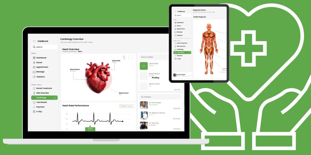
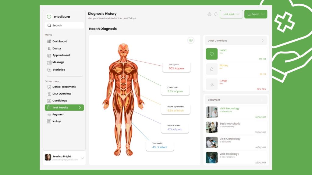
- Key Features Delivered:
- Health tracker for symptoms & medical history
- Easy-upload portal for local consultants’ reports
- Calendar tool for appointments & reminders
- Accessible UI for low-data environments
- Design Reviews: Led stakeholder presentations, walking through flows and rationales, gathering feedback iteratively.
- Handoff: Collaborated closely with developers for implementation, providing specs, redlines, and responsive variants.
💡 Final Outcomes
- Reduced user confusion and increased engagement with a clean, intuitive UI
- Achieved 90% task success rate during final testing round
- Stakeholders praised the platform’s balance of simplicity and functionality
- System scalability planned for 3 new regions post-launch
🧠 Key Takeaways
- Strategic research and alignment with stakeholders early on saved time during later phases.
- Designing for inclusivity is not just a checklist—it’s a mindset baked into every design decision.
- As a design leader, balancing big-picture goals with detail-oriented execution was critical to the platform’s success.
Visuals


Final Design:


Thank you for reading.
