
Overview
Enhance Metrobank online banking log in process flow for Metrobank customers.
Problem statement
Customers have found it increasingly difficult and frustrating logging in to the online banking platform of Metrobank due to the series of log in details and combinations needed to log in which is very unlikely customers will be able to remember and feels very inefficient compared to other online bank platforms log in process.
Target Audience
Target audience are 18-35 year old Metrobank customers who are looking for a faster way of logging into their online banking platform.
Design Thinking Process
The Process
In order to have best approach the redesign I used the ‘Design Thinking’ UCD process which is split into five parts:
- Empathise – Focus on understanding user and research apporach
- Define -Defining pain points from research and coming up with solutions
- Ideate – Sketches of ideas and wireframes
- Prototype – Development of an interactive prototype
- Test – Testing of prototype and understanding feedback from users.
Empathizing with Users
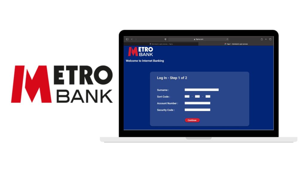
Logging into your online banking is something that you should not dread, (unless you want to avoid seeing your bank balance). It should be a very simply process and an easy experience. However when looking at the current log in process of Metrobank UK, it seems very laborious.
The current process is great for keeping the banking platform secure however I feel it is at the expense of customer experience and cognitive load.
Research Approach
To validate the assumption, I focused on a mixture of primary and secondary research.
- Research findings in relation to cognitive load when remembering numbers
- Competitive research on online banking processes
- Usability testing to test current log-in process
Define
1. Desk research findings
There is a consensus based on number of research that ‘7’ is the maximum amount of numbers an average person is able to memorize and recall from memory with any more producing significant cognitive load where the person would fail to recall.
2. Competitive Analysis
Barclays, a competitor to Metrobank, allow customers to sign in a number of ways. But what is most important is that two out of the three log-in options allow customers to start the log-in process with information the customer can find on their respective bank cards.
3. Usability Findings
I conducted usability testing with two Metrobank customers that wanted log in to the Metrobank online banking platform. The following key finding were:
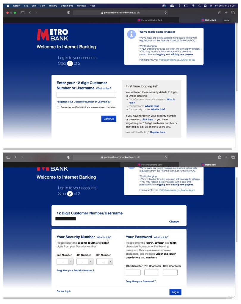
- “12 digit customer number not readily available”
- “Hard to remember security code and password”
- “Keep making mistakes on the second step”
- “Difficult and frustrating log in password”
Solution
From looking at the research findings. my ‘How Might We…’ statement focused on:
“How might we simplify the online banking log in experience”
- Creating a simpler & painless online banking log in experience for customers to access their online banking account quicker.
Ideate
Sketches
I usually start my ideation process with some very rough and quick sketches using the Crazy 8’s technique. This techniques is very effective as it allows me to create all kinds of rough sketches and ideas in a relative short time where I am able to assess them and choose which idea best address the log in process layout and content.

Wireframes
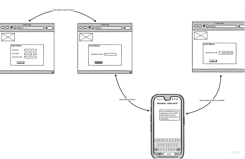
After having created some rough sketches, I have taken some of these ideas and further fleshed them out into wireframes which focused on how users would be better able to log into the Metrobank online banking platform.
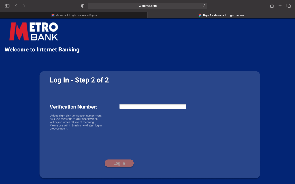
The wireframe displays how the verification text concept would be part of the log in process flow to maintain the level of security whilst also easing the memory load significantly for customers
Prototype
Prototype
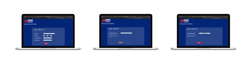
Using the wireframe above as guidelines, I proceeded to create a testable prototype in Figma (left) with the testable prototype which can be seen below:

Testing
User Testing
Before finalizing the design, I conducted another round of usability testing to make sure the log-in process worked.
Participants found the new log-in process flow:
- “Very easy to use’
- “Information used easy to find from card’
- ” Verification code timer is reassuring”
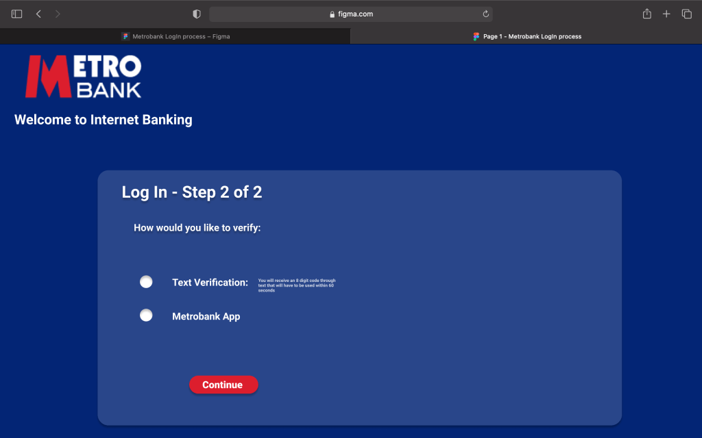
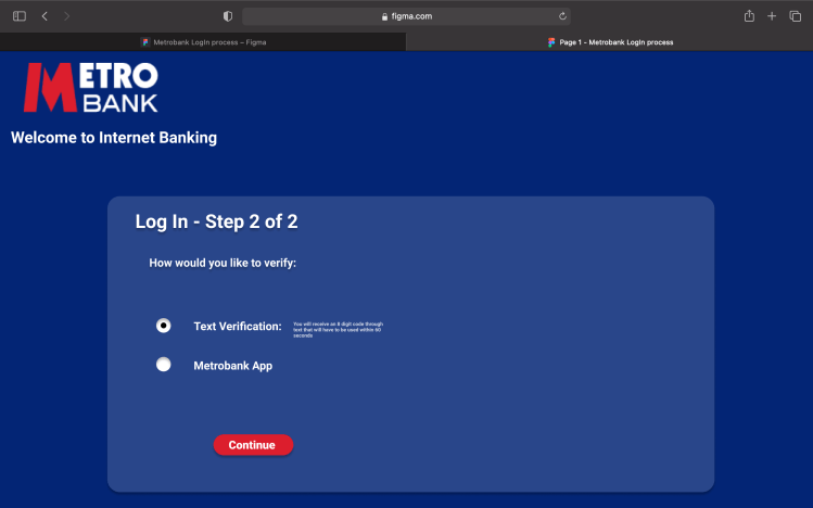
However participants have also commented that they “would like to be given the option of verifying through text or mobile banking app”.
Iteration
From the findings of the usability testing, I added an option box where customers can select how they want to verify their log-in process, whether it is through 8 digit code received through text message or verifying from their Metrobank app.
Final Design


What have I learned from the project?
This was a very interesting project as it was heavily dependant on the research conducted to make sure the research validated the initial assumptions. However even with that, what I learnt from the Metrobank log-in redesign is that the business requirements and ability to make change plays a monumental part with:
- The research conducted having to convince key business stakeholders the severity the current process has on customer experience to change the log-in process
- The viability of the business to be able to make such changes based on system infrastructure and set up.

