

Overview:
WedList is a wedding checklist app designed to help brides-to-be stay organized, save time with planning and allow easy collaboration with vendors.
Design Process
The Process:
In order to have the best approach to the redesign we used the ‘Double Diamond’ UCD process which is split into four parts:
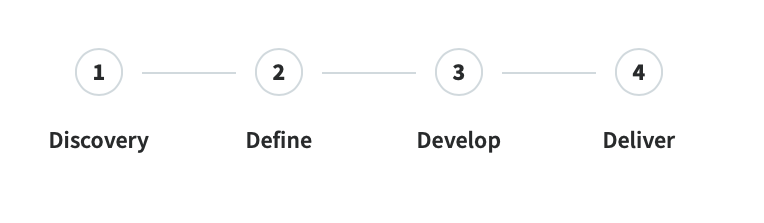
- Discovery – Focus on understanding user and research apporach
- Define – Synthesis of research and define the pain points and solutions
- Develop – Ideation, testing and iteration of solution
- Deliver – Final designs and feedback from client
Discovery Phase
The Problem:
Wedding planners and brides-to-be lack a checklist app that allows them to personalize their wedding plans and collaborate easily with their vendors.
The Goal:
Design a wedding checklist app that allows easy planning, helps users save time, and allows easy access to connect with vendors.
Role and Scope:
- Role: Lead UX Designer
- Scope: Freelance project
Responsibilities:
Research, designing paper, and digital sketches, low and high-fidelity prototyping, testing, accounting for accessibility, and iterating on designs.
Tools:
Figma
Mural
Define Phase
User Research:
I conducted interviews and created empathy map to understand the users I’m designing for and their needs. A primary user group identified through research was brides-to-be who are planning their wedding themselves. This user group confirmed initial assumptions about WedList customers, but research also revealed that accessibility was not the only factor limiting users from planning a successful wedding. Other user problems included lack of access to good vendors’ recommendations, ability to carry everyone involved in the wedding along during the planning, and finding good wedding venues.
Pain Points:
Through the data collected from our research, we found that the main pain points in the user journey of the current design want:
- Easy and simple wedding checklist app to use.
- Wedding checklist app that allows users to change the languages.
- Wedding checklist app that allows collaboration and make planning teamwork easy.
- Wedding checklist app that provides good recommendation of planners, vendors or venues with reviews.
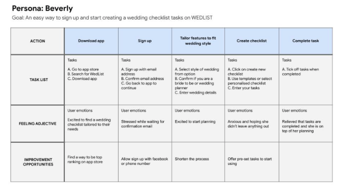
User Persona: Beverly
Beverly is a bride-to-be who needs a checklist app to help her through her wedding planning process because she wants to stay organized and save time.

User Journey Map:
Mapping Beverly’s user journey shows how helpful the Wed-List app will be to users that are planning a wedding.
Develop Phase
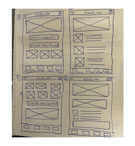
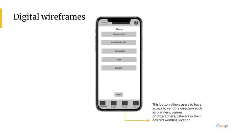
Paper Wireframe:
For the home screen, I prioritized a quick and easy way to create a new checklist to help users save time. Taking the time to draft iterations of each screen of the app on paper ensured that the elements that made it to digital wireframes would be well-suited to address user pain points.


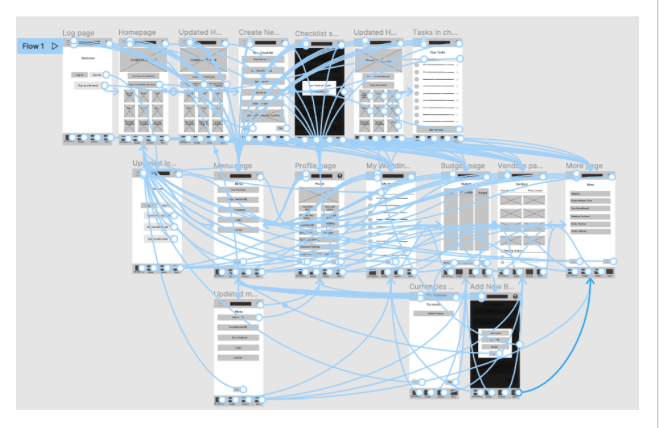
Low-Fidelity Prototype:
The low-fidelity prototype connected the primary user flow of creating a new checklist, adding tasks, and completing the tasks. So the prototype could be used in a usability study with users. View the WedList app prototype:
https://www.figma.com/file/WtOsYtm8dM04E0XxdEMEIh/Project-wireframe?node-id=0%3A1
Usability Study: Findings
I conducted two rounds of usability studies. Findings from the first study helped guide the designs from wireframes to mockups. The second study used a high-fidelity prototype and revealed what aspects of the mockups needed refining.
Round 1: Findings
- Users want an app that is easy to use.
- The “Edit profile” button wasn’t clear.
- Users struggled to sign up/Sign in into the app.
Round 2: Findings
- Users want to be able to personalise their checklist/create their checklist from scratch.
- Users want to be able to access the app in other languages.
Deliver Phase
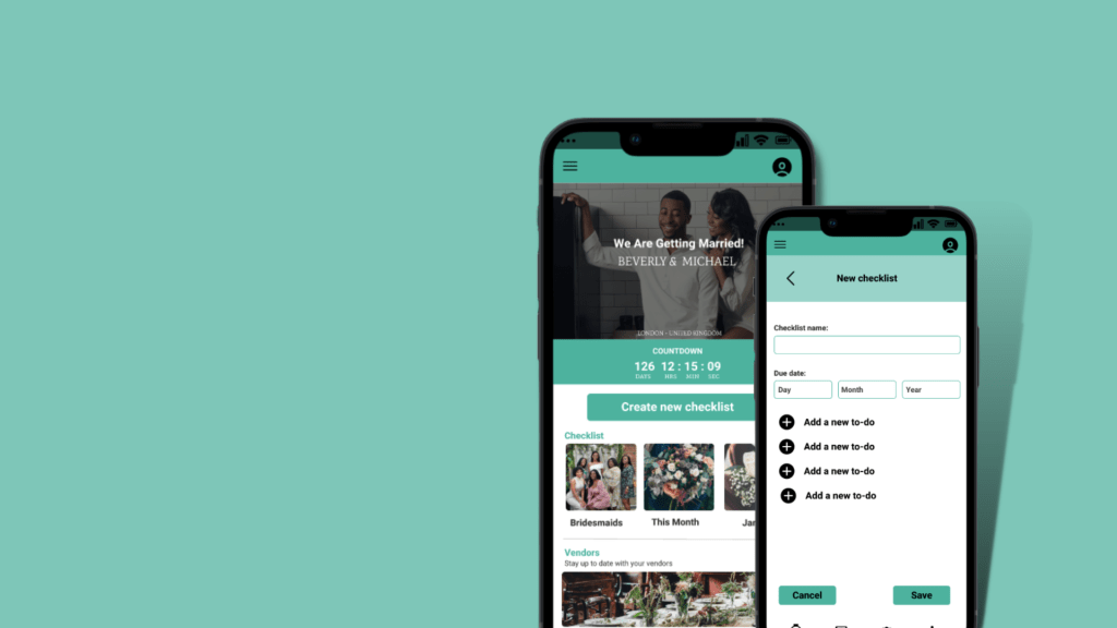
Mockups:
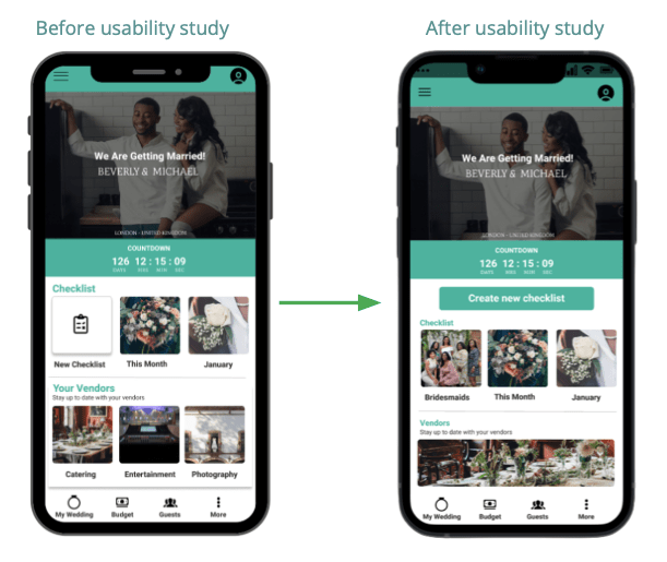
The early design allowed the user to create a new checklist but after the usability studies, I revised the design to make the action button stand out so that the user can be clear about what action to take.
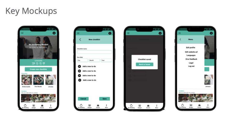
High-Fidelity Prototype:
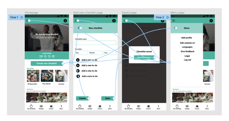
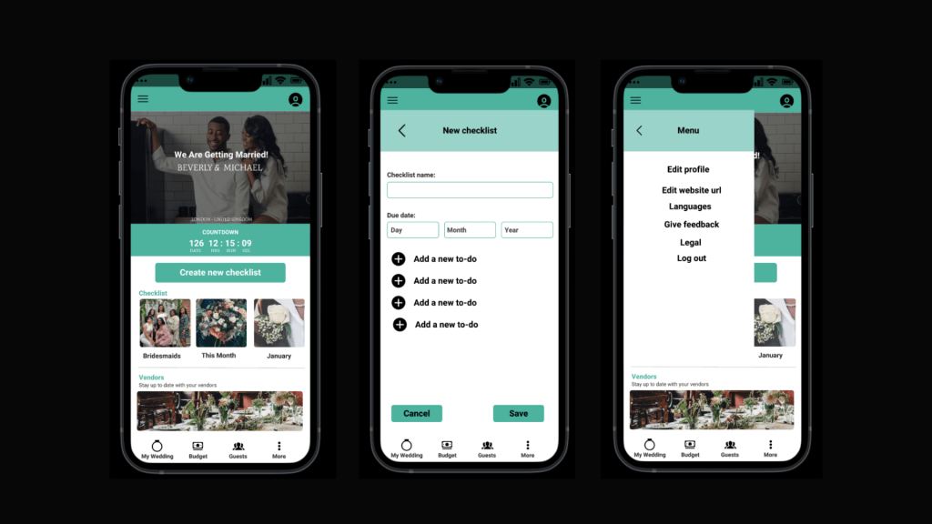
The final high-fidelity prototype presented cleaner user flows for creating a new checklist with tasks. It also met user needs to create their own template as well as more customization of their checklist. View the WedList app:
https://www.figma.com/file/WtOsYtm8dM04E0XxdEMEIh/Project-wireframe?node-id=176%3A2
Accessibility Considerations:
- Used icons to help make navigation easier.
- Users can change to their desired language and currencies in budgeting.
- Make the images and colors clear for visually impaired users.
Final Result:
Takeaways:
Impact: The features on the app shows the Wed-List app that their needs are prioritized.
A quote from user feedback:
“I really love that this app allows me to have everything about wedding planning in one place.”
What I learned: I learned that as a designer, I need to be open to feedback in order to design a product that really solves users’ problems.
Next Steps:
- Continue research to ensure product align with users need.
- Add necessary features to keep meeting users need.
- Set KPI’s that meet both users and business goals.
- Conduct another round of usability studies to ensure the design is answering the users need.
