
Overview: A group re-design challenge of the Koho online banking website dashboard and improve customers’ support system that allows customers to easily access support, get feedback and stop unauthorised transactions on their account.
Problem Statement:
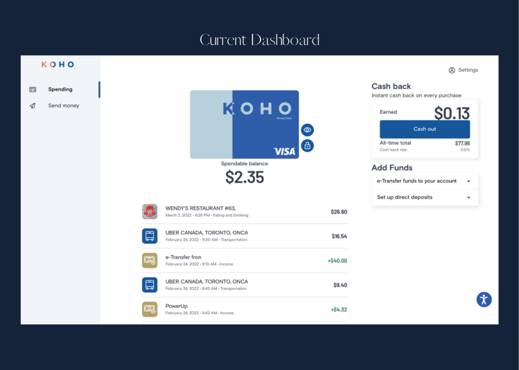
Customers have found it increasingly frustrating to complete everyday banking tasks on the online dashboard on Koho due to limited features available on the online platform and when they ran into problems, customer support is “non-existence” according to many users.
Target Audience:
The target audience is 18-35-year-old Koho customers who are looking for tech and user-friendly banking with quick resolution support both on the app and website.
Solution:
- Dashboard: Creating a simpler & painless online banking dashboard experience for customers to access their online banking accounts quicker.
- Help: Develop a user-friendly support sytsem that is efficient, quick and practical that guarantees faster ways to solve customers problem.
- Card/Transaction manager: Create triggers that helps customers avoid un-authorised transactions or tasks on their account.
Role and Scope:
- Role: User Experience Designer
- Team: 1 x UX Designer, 1 x Product Owner, 1 x Front-End Developer and 1 x Software Engineer
- Scope: Group Re-design challenge
Tools:
- Figma
- Mural
Design Process:
The Process:
In order to have the best approach to the redesign I used the ‘Design Thinking’ UCD process which is split into five parts:

- Empathise – Focus on understanding user and research apporach
- Define -Defining pain points from research and coming up with solutions
- Ideate – Sketches of ideas and wireframes
- Prototype – Development of an interactive prototype
- Test – Testing of prototype and understanding feedback from users
Empathize with the user:
Koho assumed users perform most transactions on mobile which justifies why the current dashboard is very limiting. Users want to be able to equally perform all their tasks both on the website especially when the mobile app is updating. Customers also mentioned the delay and frustration of getting in touch with the customer care team. Also experiencing double transactions on their account.
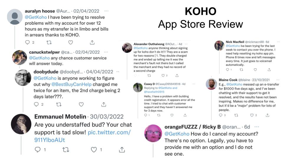
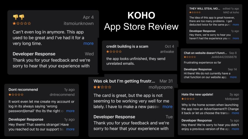
Research Approach:
I conducted research by using the reviews customers have left on the App Store. This approach felt more effective a users of the app gave their own accounts of their experiences with Koho App without asking users targeted questions through 1:1 interviews. The App Store also provided a mixture of quantitative data (ratings of the app) and qualitative feedback (particular pain points and frustration of the app). I also gathered some insights from Koho customer service team’s social media account where customers openly shared their pain points.

Define:
Findings:
From the App Store review of the original Koho app, it became apparent from the reviews that although the user experience on the app is great. However, there were a lot of frustrations from users on the lack of functionality and frustrations with the usability of the website.
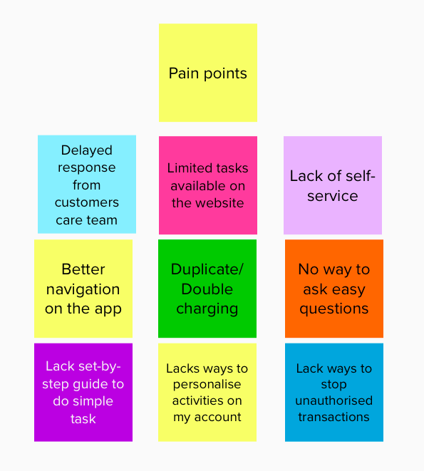
Some of the main pain points I discovered were:
- “….Difficulties to get help and support…”
- “….Delayed response…”
- “…Duplicate transactions..”
- “…Limited functions allowed on the website…”
How Might We…
Solution:
After understanding some of the main pain points of the app from the research, I focused on identifying solutions that can address the main pain points of the app.
Using the “How Might We…” statement technique, I listed a few “How Might We” statements (pictured on the top) to see whether those statements addressed the main pain points.

Ideate:
Sketches:
I usually start my ideation process with some very rough and quick sketches using the Crazy 8’s technique. This technique is very effective as it allows me to create all kinds of rough sketches and ideas in a relatively short time where I am able to assess them and choose which idea best addresses the dashboard layout and content.

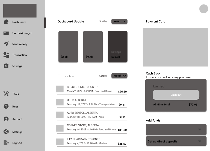
Wireframes:
After having created some rough sketches, I have taken some of these ideas and further fleshed them out into wireframes that focused on how users would have a better experience with Koho online banking platform, get timely support and avoid unauthorized transactions.
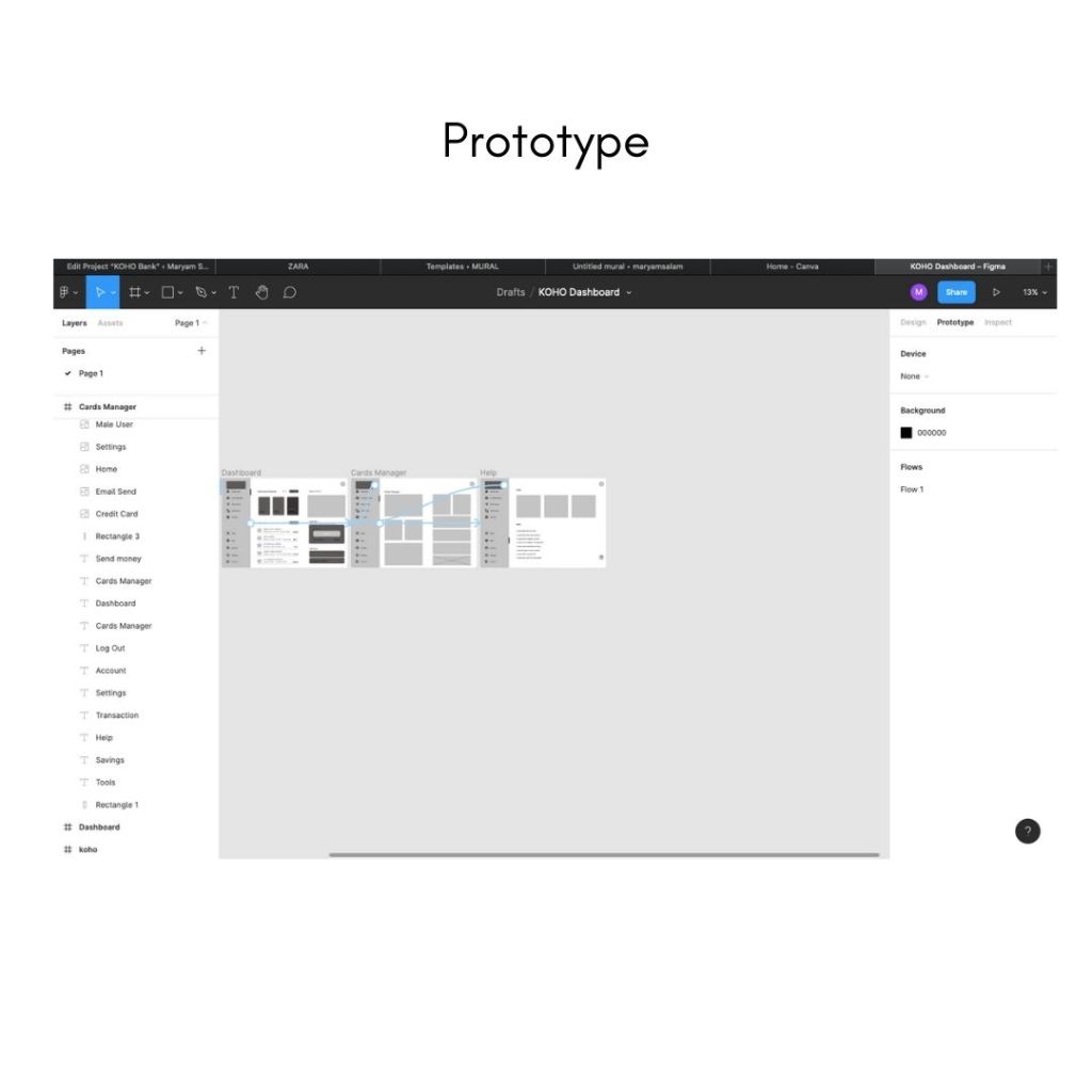
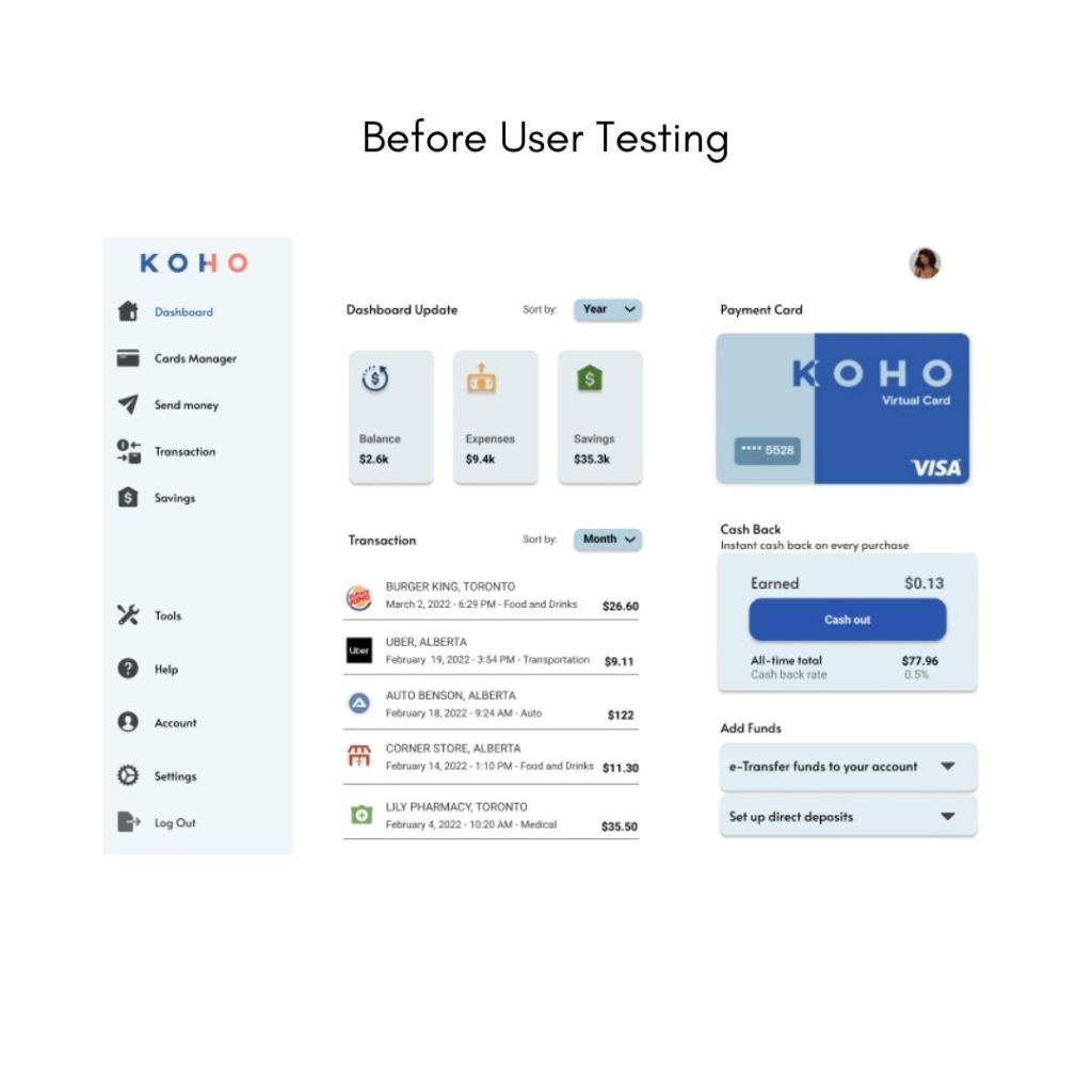
Prototype:
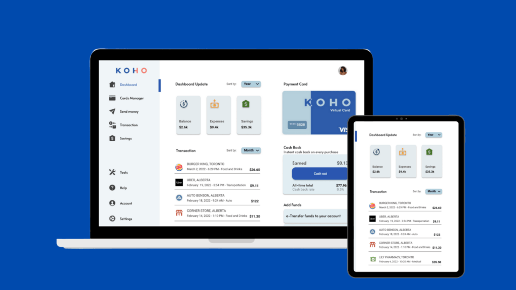
Using the wireframe above as guidelines, I proceeded to create a testable prototype in Figma:
Re-design:
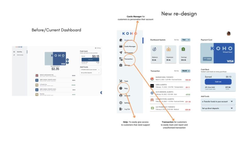
Information Architecture
It is important to develop a clear Information Architecture (IA) to structure the functions on the website to support usability and findability for users.

Test:
User Testing:
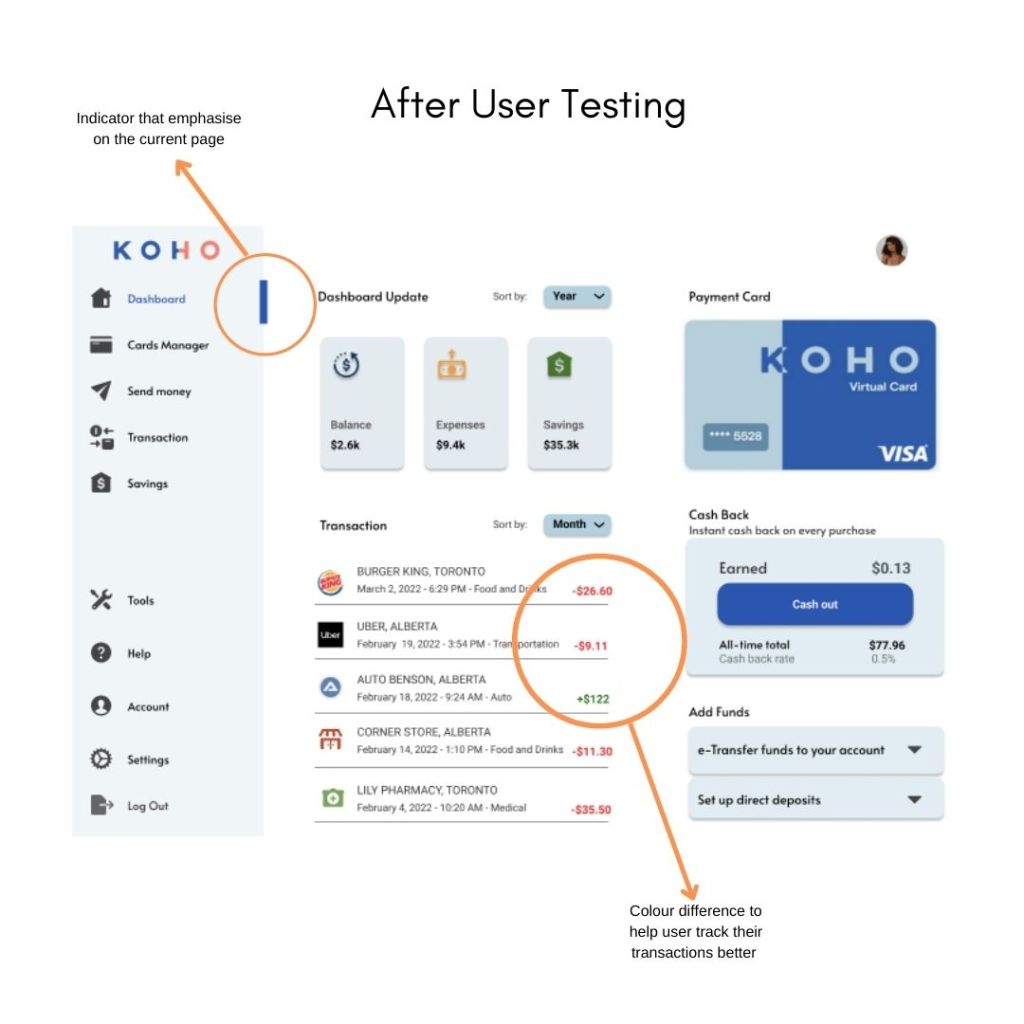
Before finalizing the design, I conducted another round of usability testing to make sure the dashboard features are effective and solve user pain points.
Participants said that on the new design:
- “…The new dashboard is informative…”
- “….It is easier to find help and talk to someone..”
- “….Hopefully, I will face less issues with the new website..”
- “….Now, I will be able to turn on the duplicate payment option to stop any double payment..”
- But
- “….Struggle to identify which page I am on…”
- “…Difficult to differentiate my transactions on the homepage…”

Iterations:
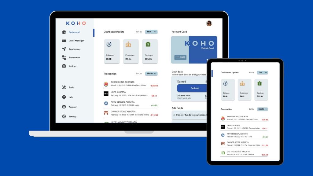
Final Design
What have I learned from this project:
This was a very interesting project as it was heavily dependent on the research conducted to make sure the research-validated the initial assumptions. However even with that, what I learned from the Koho dashboard redesign is that the business requirements and ability to make change play a monumental part with:
- The research conducted having to convince key business stakeholders the severity the current process has on customer experience to update the online dashboard.
- The viability of the business to be able to make such changes based on system infrastructure and set up.
- One of my key learnings was from research, due to Covid-19 I found it a challenge getting actual live user interviews and not being able to validate assumptions through direct 1-1 interviews.